library(tidyverse)
library(tvthemes)
library(ggthemes)
library(scales)

new_data <- readxl::read_xlsx("Billionaires.xlsx")Top Richest People in the World
EDA
dplyr
data analysis
Introduction
The presentation contains data from kaggle , it has data for people recorded as billionaires as of August ,2023.
Setup
- read in data and load libraries
data validation
names(new_data)
#> [1] "Rank"              "Name"              "Net Worth"
#> [4] "Change"            "Age"               "Source"
#> [7] "Country/Territory"- rank : ranking of the billionaire in the world
- Name : name of billionaire
- net worth : measure of his/her total assets
- Country/Territory : country based
- Source : Source of income
- Age : age of billionaire
sapply(new_data[1,],class)
#>              Rank              Name         Net Worth            Change
#>         "numeric"       "character"       "character"       "character"
#>               Age            Source Country/Territory
#>         "numeric"       "character"       "character"
data cleaning
- we need net worth to be numeric so we will remove the characters
(new_data<-new_data |>
  mutate(net_worth= readr::parse_number(`Net Worth`)) |>
  relocate(net_worth,`Net Worth`)) # removes character strings from the data
#> # A tibble: 500 × 8
#>    net_worth `Net Worth`  Rank Name      Change   Age Source `Country/Territory`
#>        <dbl> <chr>       <dbl> <chr>     <chr>  <dbl> <chr>  <chr>
#>  1     232.  $232.2 B        1 Bernard …  $0M …    74 LVMH   France
#>  2     185.  $184.7 B        2 Elon Musk  $0M …    51 Tesla… United States
#>  3     139.  $139.1 B        3 Jeff Bez…  $0M …    59 Amazon United States
#>  4     128.  $127.8 B        4 Larry El…  $0M …    78 Oracle United States
#>  5     116.  $116.3 B        5 Warren B…  $0M …    92 Berks… United States
#>  6     114.  $114.3 B        6 Bill Gat…  $0M …    67 Micro… United States
#>  7     104.  $104.2 B        7 Larry Pa…  $0M …    50 Google United States
#>  8      99.1 $99.1 B         8 Sergey B…  $0M …    49 Google United States
#>  9      98.4 $98.4 B         9 Steve Ba…  $0M …    67 Micro… United States
#> 10      97.3 $97.3 B        10 Carlos S…  $0M …    83 Telec… Mexico
#> # ℹ 490 more rows- nice , we see that we removed the
dollarandBcharacters.
Data Exploration
- what is the distribution of wealth?
library(statip)
min_val <- min(new_data$net_worth)
max_val <- max(new_data$net_worth)
mean_val <- mean(new_data$net_worth)
med_val <- median(new_data$net_worth)
mod_val <- mfv(new_data$net_worth)

# Print the stats
glue::glue(
  'Minimum: {format(round(min_val, 2), nsmall = 2)}
   Mean: {format(round(mean_val, 2), nsmall = 2)}
   Median: {format(round(med_val, 2), nsmall = 2)}
   Mode: {format(round(mod_val, 2), nsmall = 2)}
   Maximum: {format(round(max_val, 2), nsmall = 2)}'
)
#> Minimum: 5.40
#> Mean: 15.19
#> Median: 8.30
#> Mode: 6.20
#> Maximum: 232.20
#> Minimum: 5.40
#> Mean: 15.19
#> Median: 8.30
#> Mode: 7.00
#> Maximum: 232.20


new_data |>
  ggplot() +
  geom_histogram(aes(x = net_worth),
                 fill = "firebrick", alpha = 0.66) +
  labs(title = "Distribition of wealth") +
  theme(plot.title = element_text(hjust = 0.5, size = 14),
        axis.title.x = element_blank(),
        axis.title.y = element_blank(),
        axis.text.y = element_blank(),
        axis.ticks.y = element_blank())+
  ggthemes::scale_fill_tableau()+
  tvthemes::theme_theLastAirbender(title.font="Slayer",text.font = "Slayer")+
  geom_vline(xintercept = min_val, color = 'gray33', linetype = "dashed", size = 1.3)+
  geom_vline(xintercept = mean_val, color = 'cyan', linetype = "dashed", size = 1.3)+
  geom_vline(xintercept = med_val, color = 'red', linetype = "dashed", size = 1.3 )+
  geom_vline(xintercept = mod_val, color = 'yellow', linetype = "dashed", size = 1.3 )+
  geom_vline(xintercept = max_val, color = 'gray33', linetype = "dashed", size = 1.3 )+
  labs(x="Net Worth")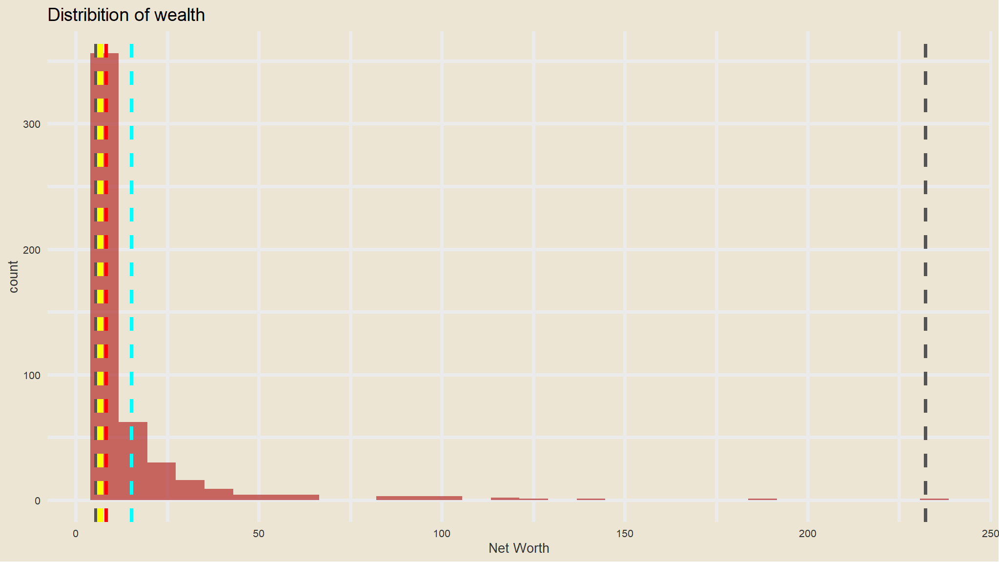
- the richest person has around
$232BWhereas most guys are around$7B(MODE).
new_data %>%
  ggplot(aes(x=1, y=net_worth)) +
  geom_boxplot() +
  scale_fill_avatar()+
  theme_avatar()+
  labs(y="Net Worth")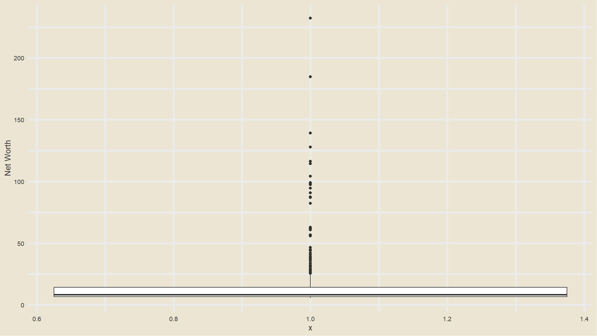
distribution of age
min_val <- min(new_data$Age,na.rm=TRUE)
max_val <- max(new_data$Age,na.rm=TRUE)
mean_val <- mean(new_data$Age,na.rm=TRUE)
med_val <- median(new_data$Age,na.rm=TRUE)
mod_val <- mfv(new_data$Age,na.rm=TRUE)

# Print the stats
glue::glue(
  'Minimum: {format(round(min_val, 2), nsmall = 2)}
   Mean: {format(round(mean_val, 2), nsmall = 2)}
   Median: {format(round(med_val, 2), nsmall = 2)}
   Mode: {format(round(mod_val, 2), nsmall = 2)}
   Maximum: {format(round(max_val, 2), nsmall = 2)}'
)
#> Minimum: 31.00
#> Mean: 67.69
#> Median: 68.00
#> Mode: 59.00
#> Maximum: 99.00


new_data |>
  ggplot() +
  geom_histogram(aes(x = Age),
                 fill = "firebrick", alpha = 0.66) +
  labs(title = "Distrubition of Age") +
  theme(plot.title = element_text(hjust = 0.5, size = 14),
        axis.title.x = element_blank(),
        axis.title.y = element_blank(),
        axis.text.y = element_blank(),
        axis.ticks.y = element_blank())+
  ggthemes::scale_fill_tableau()+
  ggthemes::theme_pander()+
  geom_vline(xintercept = min_val, color = 'blue', linetype = "dashed", size = 1.3)+
  geom_vline(xintercept = mean_val, color = 'cyan', linetype = "dashed", size = 1.3)+
  geom_vline(xintercept = mod_val, color = 'yellow', linetype = "dashed", size = 1.3 )+
  geom_vline(xintercept = max_val, color = 'gray33', linetype = "dashed", size = 1.3 )+
  annotate("text",x=min_val,y=20,label="min")+
  annotate("text",x=max_val,y=20,label="max")+
  annotate("text",x=mean_val,y=20,label="Mean")+
  annotate("text",x=mod_val,y=20,label="mode")
- the youngest billionaire is
31 yearsof age - the oldest is close to a
100
Who are the top 10 richest?
plot_data<-new_data |>
  arrange(desc(net_worth)) |>
  head(n=10)

ggplot(data=plot_data,
       aes(x=reorder(Name,-desc(net_worth)), y= net_worth,
           fill=Source, label=paste0(net_worth,"B"))) +
    geom_bar(stat = "identity", colour="black") +
    coord_flip() +
    labs(x=" ", y="Billion($US)", fill=" ",caption="Source:Forbes,Bongani Ncube")  +
    theme_minimal() +
    ggthemes::scale_fill_tableau() +
    scale_y_continuous(label=dollar_format()) +
geom_label(show_guide = F, aes(y=10)) 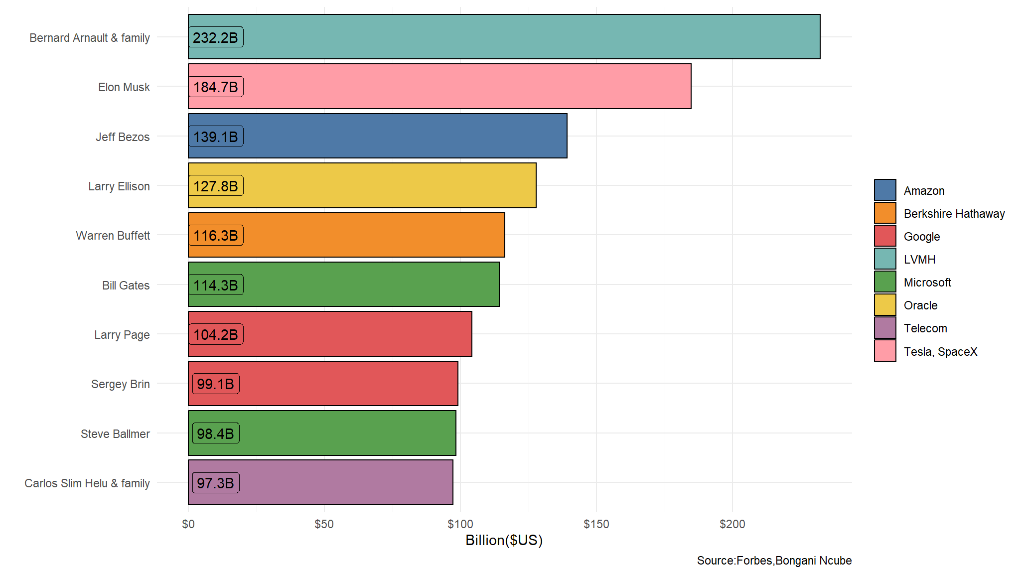
- from the top 10 ,2 are from Google
which country has the most richest people
plot_data<-new_data |>
  arrange(desc(net_worth)) |>
  head(n=10)

ggplot(data=plot_data,
       aes(x=reorder(Name,-desc(net_worth)), y= net_worth,
           fill=`Country/Territory`, label=paste0(net_worth,"B"))) +
    geom_bar(stat = "identity", colour="black") +
    coord_flip() +
    labs(x=" ", y="Billion($US)", fill=" ",caption="Source:Forbes,Bongani Ncube")  +
    theme_minimal() +
    ggthemes::scale_fill_tableau() +
    scale_y_continuous(label=dollar_format()) +
geom_label(show_guide = F, aes(y=10)) 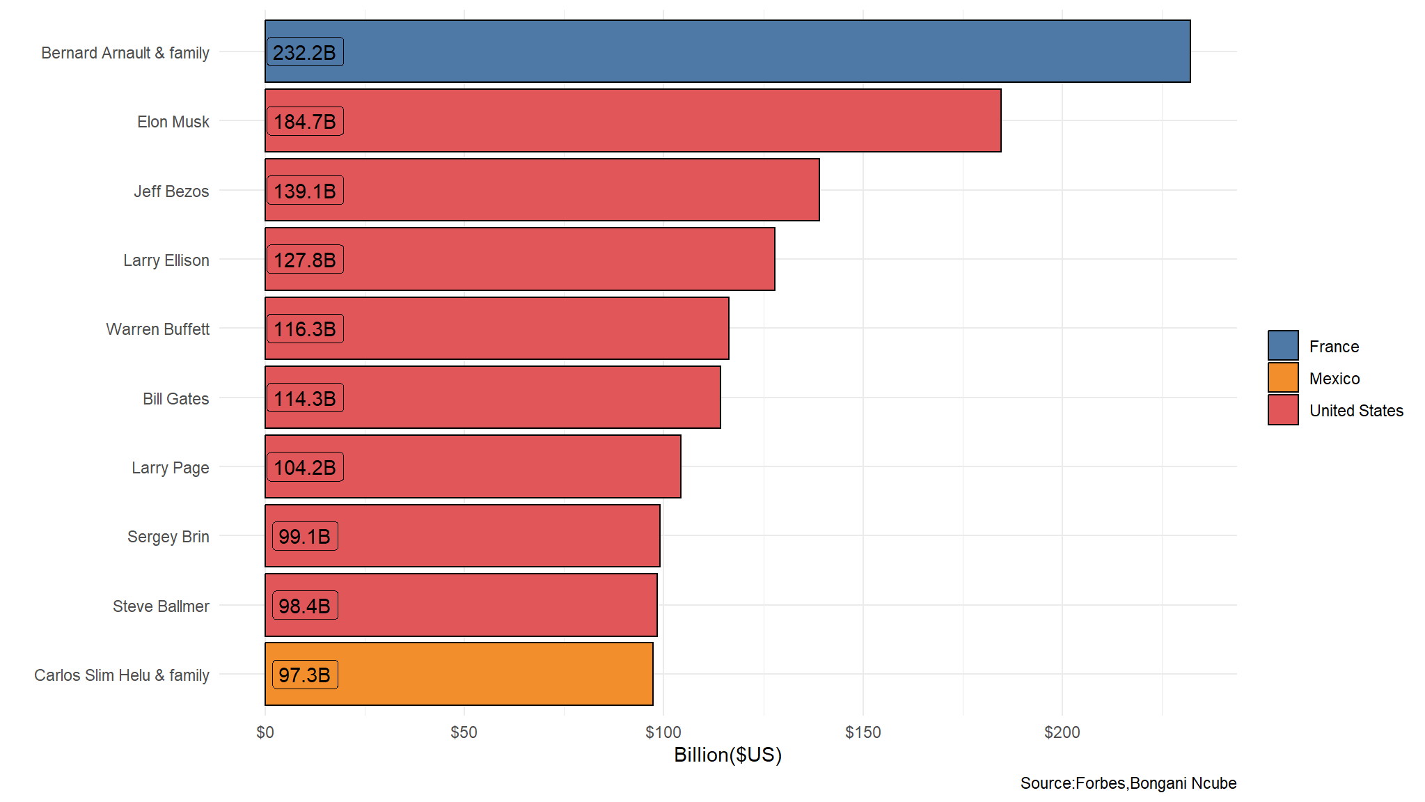
- the majority of the richest people are from the United States of America
is there a relationship between age and wet worth?
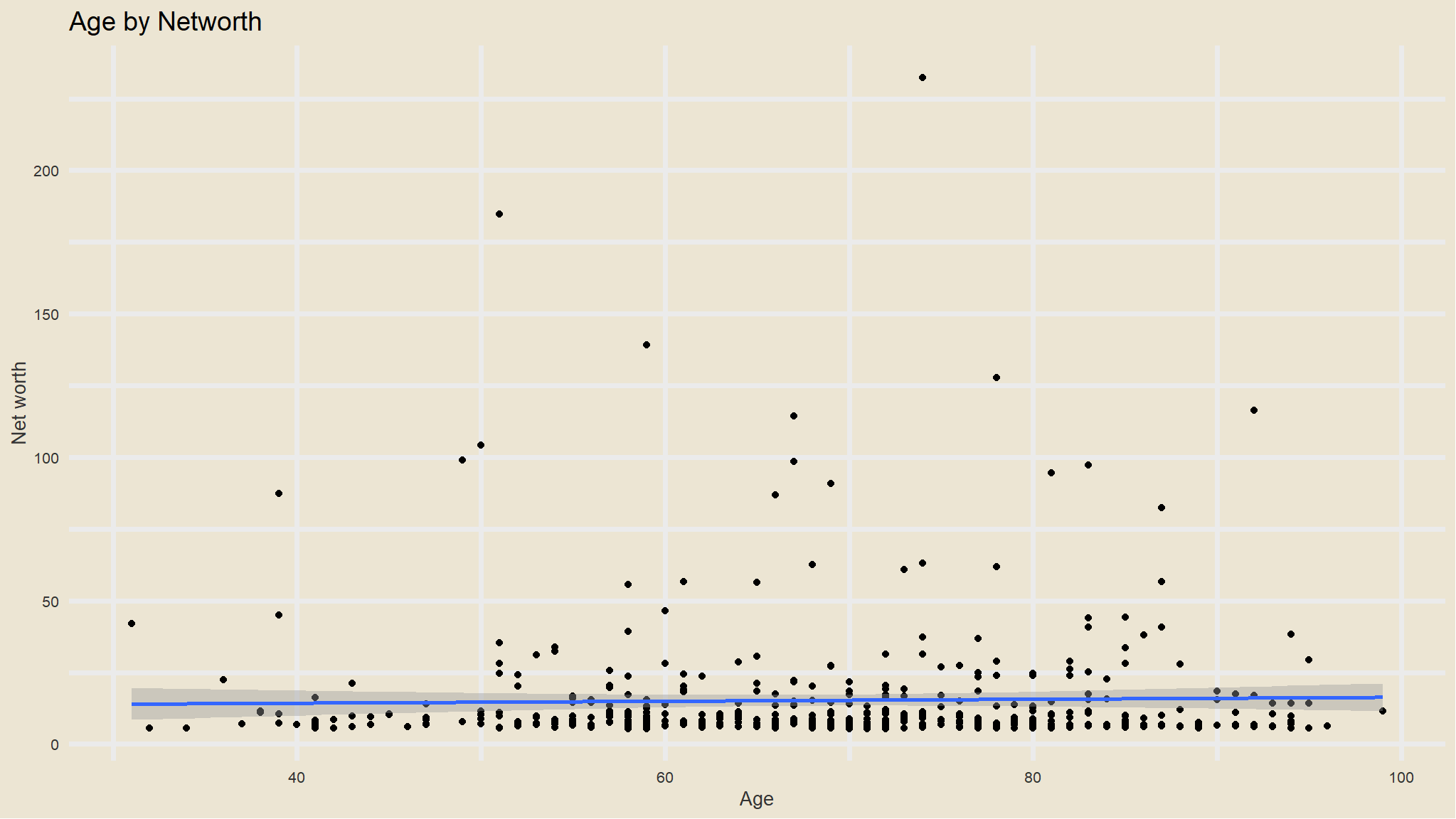
- not really!
what are the top 10 sources of wealth for the richest
new_data |>
  group_by(Source) |>
  summarise(Average=mean(net_worth,na.rm=TRUE)) |>
  arrange(desc(Average)) |>
  head(10) |>
  mutate(Source=fct_reorder(Source, Average)) |>
  ggplot(aes(Source, Average)) +
  geom_col(aes(color=Source)) +
  scale_color_tableau() +
  theme_avatar()+
  labs(x="Source",
       y="Average net worth",
       title="Top 10 billionaire sources") +
  coord_flip() +
  geom_text(aes(label=paste0(round(Average), "B"), hjust=1), col="blue")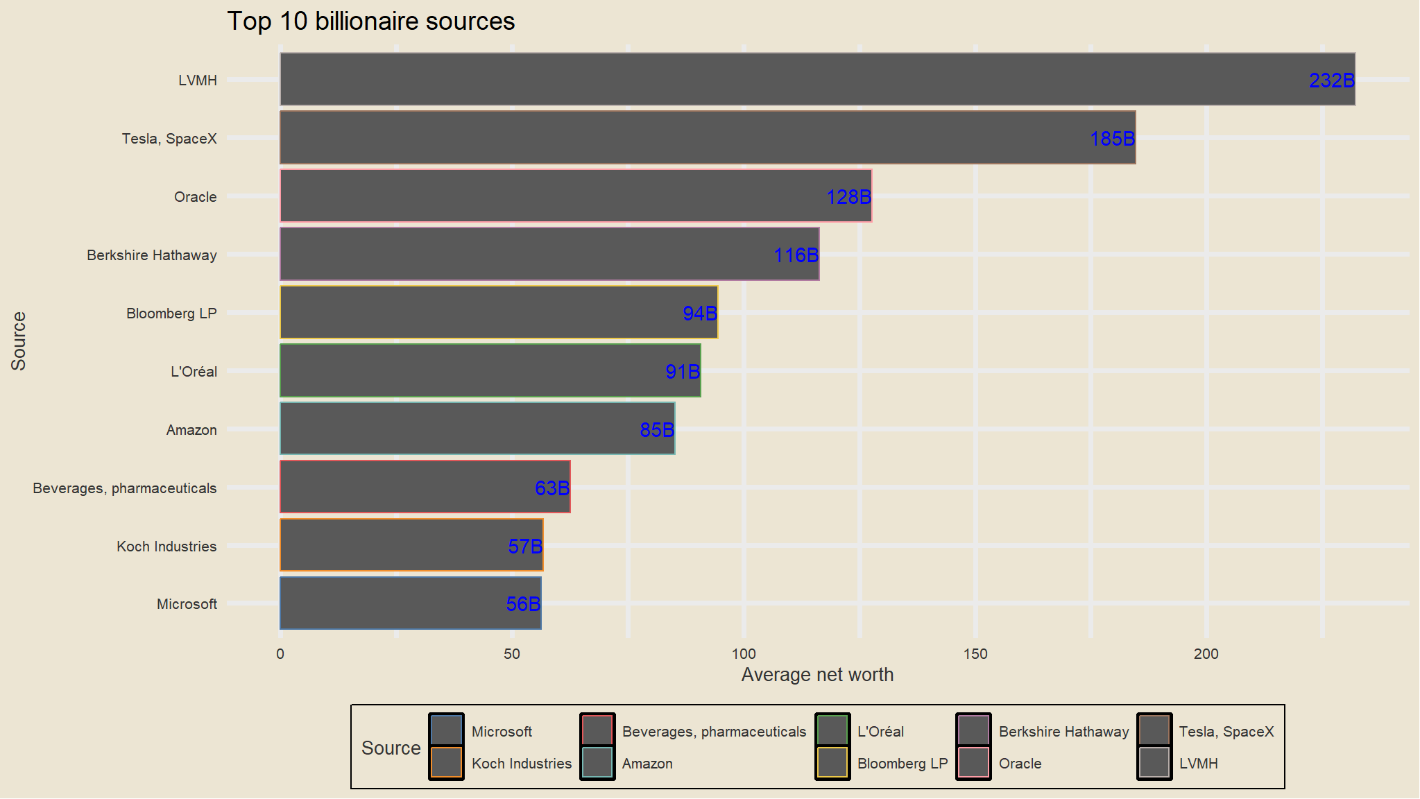
- still the technology industry seems to the most dominant and most fruitful
which age groups have the most number of billionaires
out_new<-new_data |>
  mutate(age_group = cut(Age,breaks = c(30,40,50,60,70,80,90,100),
                         labels = c("31 to 40","41 to 50","51 to 60",
                                    "61 to 70","71 to 80","81 to 90",
                                    "91 to 100")),
         age_group = if_else(is.na(age_group),"not specify",age_group))

table(out_new$age_group)
#>
#>    31 to 40    41 to 50    51 to 60    61 to 70    71 to 80    81 to 90
#>          13          33         116         114         128          65
#>   91 to 100 not specify
#> 24 7- i will visualize these results
plot_data<- out_new |>
  group_by(age_group) |>
  summarise(n=n())

ggplot(data=plot_data,
       aes(x=reorder(age_group,-desc(n)), y= n,
           fill=age_group, label=paste0(n,"people"))) +
    geom_bar(stat = "identity", colour="black") +
    coord_flip() +
    labs(x="Age group", y="number of people", fill=" ")  +
    theme_minimal() +
    ggthemes::scale_fill_tableau() +
geom_label(show_guide = F, aes(y=10)) 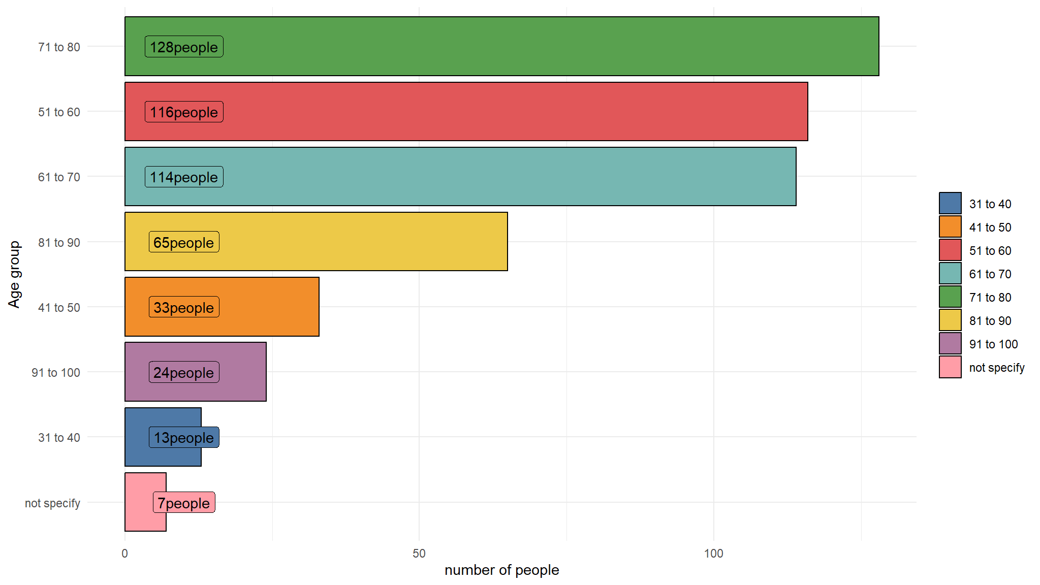
- majority of the billionaires are in the 51 to 80 age category !
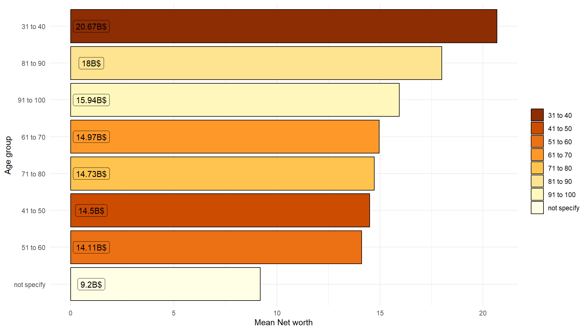
which age groups have the highest average net worth
plot_data<- out_new |>
  group_by(age_group) |>
  summarise(Average=round(mean(net_worth,na.rm=T),2))

ggplot(data=plot_data,
       aes(x=reorder(age_group,-desc(Average)), y= Average,
           fill=age_group, label=paste0(Average,"B$"))) +
    geom_bar(stat = "identity", colour="black") +
    coord_flip() +
    labs(x="Age group", y="Mean Net worth", fill=" ")  +
    theme_minimal() +
    scale_fill_brewer(palette = "YlOrBr",direction = -1) +
    geom_label(show_guide  = F, aes(y=1))