options(scipen=999)
## load packages
library(tidyverse)
library(infer)
library(scales)     # Nicer formatting for numbers
library(broom)      # Convert model results to tidy data frames
library(infer)      # Statistical inference with simulation
library(ggridges)   # Ridge plots
library(ggstance)   # Horizontal pointranges and bars
library(patchwork)
## define custom theme

theme_fancy <- function() {
  theme_minimal(base_family = "Asap Condensed") +
    theme(panel.grid.minor = element_blank())
}

## load in the dataset
out_new<- vroom::vroom("bloodpressure.csv")Hemoglobin and Blood Pressure in clinical trials -Beyond the t.test
permutations
bootstrapping
inference
Introduction
In my last linkedin Post I mentioned about how :
- Taking a sample from two groups from a population and seeing if there’s a significant or substantial difference between them is a standard task in statistics.
- Measuring performance on a test before and after some sort of intervention, measuring average GDP in two different continents, measuring average height in two groups of flowers, etc.
- we like to know if any group differences we see are attributable to chance / measurement error, or if they’re real.
In most cases statisticians opt to answer these questions using the
t.test()
load the dataset and package
Data dictionery
recode the dataset
- I once carried out a study using this data on B Ncube Analysis
data_new<- out_new |>
  mutate(Blood_Pressure_Abnormality= ifelse(Blood_Pressure_Abnormality==0,"Normal","Abnormal")) |>
  mutate(Sex = ifelse(Sex==0,"Male","Female")) |>
  mutate(Pregnancy=ifelse(Pregnancy==0,"No","Yes")) |>
  mutate(Smoking=ifelse(Smoking==0,"No","Yes")) |>
  mutate(Chronic_kidney_disease=ifelse(Chronic_kidney_disease==0,"No","Yes")) |>
  mutate(Adrenal_and_thyroid_disorders=ifelse(Adrenal_and_thyroid_disorders==0,"No","Yes")) |>
  mutate(Level_of_Stress=case_when(Level_of_Stress==1~"Less",
                                   Level_of_Stress==2~"Normal",
                                   Level_of_Stress==3~"High"))
Explanatory Data Analysis
temp.1<-data_new |>
  group_by(Blood_Pressure_Abnormality) |>
  mutate(x.lab=paste0(Blood_Pressure_Abnormality,
                      "\n",
                      "(n=",
                      n(),
                      ")"))
eda_boxplot <- ggplot(temp.1,
       aes(x=x.lab,
           y=Level_of_Hemoglobin,
           fill=Blood_Pressure_Abnormality))+
  geom_boxplot(outlier.shape = NA)+
  stat_boxplot(geom="errorbar")+
  geom_jitter(aes(fill=Blood_Pressure_Abnormality),
              shape=21,
              alpha=0.8,
              width=0.05)+
  scale_y_continuous(limits=c(0,20),
                     labels=function(x) paste0(
                                               {x/1},"g/dl"))+
  ggthemes::scale_fill_tableau()+
  ggthemes::theme_pander()+
  labs(x="BP level",
       y="Level Of Hemoglobin",
       title="Distribution of hemoglobin by BP level")+
  theme_fancy()

eda_histogram <- ggplot(data_new, aes(x = Level_of_Hemoglobin, fill = Blood_Pressure_Abnormality)) +
  geom_histogram(binwidth = 1, color = "white") +
  scale_fill_manual(values = c("#0288b7", "#a90010"), guide = FALSE) +
  scale_x_continuous(breaks = seq(1, 10, 1)) +
  labs(y = "Count", x = "Level of Hemoglobin") +
  facet_wrap(~ Blood_Pressure_Abnormality, nrow = 2) +
  theme_fancy() +
  theme(panel.grid.major.x = element_blank())

eda_ridges <- ggplot(data_new, aes(x = Level_of_Hemoglobin, y = fct_rev(Blood_Pressure_Abnormality), fill = Blood_Pressure_Abnormality)) +
  stat_density_ridges(quantile_lines = TRUE, quantiles = 2, scale = 3, color = "white") +
  scale_fill_manual(values = c("#0288b7", "#a90010"), guide = FALSE) +
  scale_x_continuous(breaks = seq(0, 10, 2)) +
  labs(x = "Level of Hemoglobin", y = NULL,
       subtitle = "White line shows median Level of Hemoglobin") +
  theme_fancy()

(eda_boxplot | eda_histogram) /
    eda_ridges +
  plot_annotation(title = "Do Abnormal BP patients have higher Level of Hemoglobin than those with Normal Blood pressure?",
                  subtitle = "Sample of 400 patients",
                  theme = theme(text = element_text(family = "Asap Condensed"),
                                plot.title = element_text(face = "bold",
                                                          size = rel(1.5))))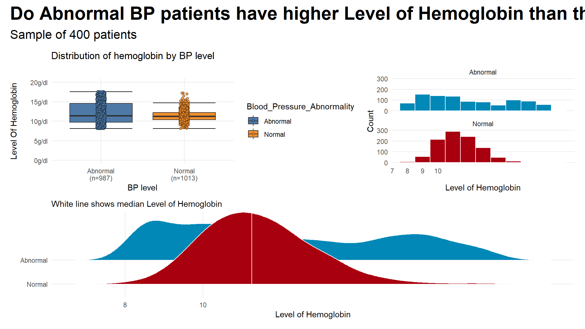
- the plots suggest that there is some observable differences in hemoglogin between the two groups
- but visuals alone are not enough to give a clear picture of the data
Run a t.test assuming equal variances.
# Assume equal variances
t_test_eq <- t.test(Level_of_Hemoglobin ~ Blood_Pressure_Abnormality, data = data_new, var.equal = TRUE)
t_test_eq
#>
#>  Two Sample t-test
#>
#> data:  Level_of_Hemoglobin by Blood_Pressure_Abnormality
#> t = 6.2965, df = 1998, p-value = 0.0000000003733
#> alternative hypothesis: true difference in means between group Abnormal and group Normal is not equal to 0
#> 95 percent confidence interval:
#>  0.4199599 0.7999081
#> sample estimates:
#> mean in group Abnormal   mean in group Normal
#>               12.01897               11.40903
SIDENOTE 🚗 The default output is helpful—the p-value is really tiny (p<0.001), which means there’s a tiny chance that we’d see a difference that big in group means in a world where there’s no difference
but there is some drawbacks with this
- there are some assumptions that need to be met for the t.test to work
- some the more general assumptions are **equality of variances* and normality of data
testing for assumptions
For all these tests, the null hypothesis is that the two groups have similar (homogeneous) variances. If the p-value is less than 0.05, we can assume that they have unequal or heterogeneous variances.
- Bartlett test: Check homogeneity of variances based on the mean
bartlett.test(Level_of_Hemoglobin ~ Blood_Pressure_Abnormality, data = data_new)
#>
#>  Bartlett test of homogeneity of variances
#>
#> data:  Level_of_Hemoglobin by Blood_Pressure_Abnormality
#> Bartlett's K-squared = 452.93, df = 1, p-value < 0.00000000000000022- Levene test: Check homogeneity of variances based on the median, so it’s more robust to outliers
    # Install the car package first
car::leveneTest(Level_of_Hemoglobin ~ Blood_Pressure_Abnormality, data = data_new)
#> Levene's Test for Homogeneity of Variance (center = median)
#>         Df F value                Pr(>F)
#> group    1   540.2 < 0.00000000000000022 ***
#>       1998
#> ---
#> Signif. codes: 0 '***' 0.001 '**' 0.01 '*' 0.05 '.' 0.1 ' ' 1- Fligner-Killeen test: Check homogeneity of variances based on the median, so it’s more robust to outliers
fligner.test(Level_of_Hemoglobin ~ Blood_Pressure_Abnormality, data = data_new)
#>
#>  Fligner-Killeen test of homogeneity of variances
#>
#> data:  Level_of_Hemoglobin by Blood_Pressure_Abnormality
#> Fligner-Killeen:med chi-squared = 415.5, df = 1, p-value <
#> 0.00000000000000022- Kruskal-Wallis test: Check homogeneity of distributions nonparametrically
kruskal.test(Level_of_Hemoglobin ~ Blood_Pressure_Abnormality, data = data_new)
#>
#>  Kruskal-Wallis rank sum test
#>
#> data:  Level_of_Hemoglobin by Blood_Pressure_Abnormality
#> Kruskal-Wallis chi-squared = 4.9122, df = 1, p-value = 0.02667
Simulation-based tests
Instead of dealing with all the assumptions of the data and finding the exact statistical test we can use the power of bootstrapping, permutation, and simulation to construct a null distribution and calculate confidence intervals.
Step 1
# Calculate the difference in means
diff_means <- data_new %>%
  specify(Level_of_Hemoglobin ~ Blood_Pressure_Abnormality) %>%
  calculate("diff in means", order = c("Abnormal", "Normal"))
diff_means
#> Response: Level_of_Hemoglobin (numeric)
#> Explanatory: Blood_Pressure_Abnormality (factor)
#> # A tibble: 1 × 1
#>    stat
#>   <dbl>
#> 1 0.610
Step 2
boot_means <- data_new %>%
  specify(Level_of_Hemoglobin ~ Blood_Pressure_Abnormality) %>%
  generate(reps = 1000, type = "bootstrap") %>%
  calculate("diff in means", order = c("Abnormal", "Normal"))

boostrapped_confint <- boot_means %>% get_confidence_interval()

boot_means %>%
  visualize() +
  shade_confidence_interval(boostrapped_confint,
                            color = "#8bc5ed", fill = "#85d9d2") +
  geom_vline(xintercept = diff_means$stat, size = 1, color = "#77002c") +
  labs(title = "Bootstrapped distribution of differences in means",
       x = "Action − Comedy", y = "Count",
       subtitle = "Red line shows observed difference; shaded area shows 95% confidence interval") +
  theme_fancy()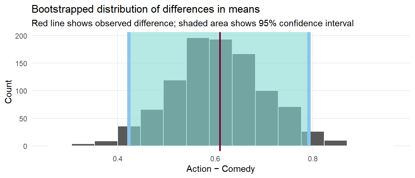
We have a simulation-based confidence interval, and it doesn’t contain zero, so we can have some confidence that there’s a real difference between the two groups.
Step 3
# Step 2: Invent a world where δ is null
genre_diffs_null <- data_new %>%
  specify(Level_of_Hemoglobin ~ Blood_Pressure_Abnormality) %>%
  hypothesize(null = "independence") %>%
  generate(reps = 5000, type = "permute") %>%
   calculate("diff in means", order = c("Abnormal", "Normal"))

# Step 3: Put actual observed δ in the null world and see if it fits
genre_diffs_null %>%
  visualize() +
  geom_vline(xintercept = diff_means$stat, size = 1, color = "#77002c") +
  scale_y_continuous(labels = comma) +
  labs(x = "Simulated difference in average ratings (Abnormal − Normal)",
       y = "Count",
       title = "Simulation-based null distribution of differences in means",
       subtitle = "Red line shows observed difference") +
  theme_fancy()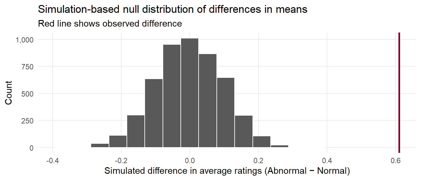
That red line is pretty far to the left and seems like it wouldn’t fit very well in a world where there’s no actual difference between the groups. We can calculate the probability of seeing that red line in a null world (step 4) with get_p_value() (and we can use the cool new pvalue() function in the scales library to format it as < 0.001):
Step 4
# Step 4: Calculate probability that observed δ could exist in null world
genre_diffs_null %>%
  get_p_value(obs_stat = diff_means, direction = "both") %>%
  mutate(p_value_clean = pvalue(p_value))
#> # A tibble: 1 × 2
#>   p_value p_value_clean
#>     <dbl> <chr>
#> 1       0 <0.001