library(tidyverse)
loan_data <- read_csv('loan_data_cleaned.csv')
loan_data <- loan_data |>
  mutate(default=ifelse(loan_status==1,"defaulted","not defaulted")) |>
mutate_if(is.character,as.factor)Grammar Of Graphics
ggplot2
data viz
geom plots
data science
background
Note
Visualisation is the process of representing data graphically and interacting with these representations. The objective is to gain insight into the data.
To work with ggplot2, remember that at least your R codes must
- start with
ggplot() - identify which data to plot
data = Your Data - state variables to plot for example
aes(x = Variable on x-axis, y = Variable on y-axis )for bivariate - choose type of graph, for example
geom_histogram()for histogram, andgeom_points()for scatterplots
setup
- installing tidyverse package which contains dplyr and ggplot2
getting started
- Calling ggplot() along just creates a blank plot
ggplot()
next up
- I need to tell ggplot what data to use
ggplot(data=loan_data)
grammar of graphics
- And then give it some instructions using the grammar of graphics.
- Let’s build a simple scatterplot with annual income on the x-axis and loan amount on the y axis
ggplot(data=loan_data) +
  geom_point(mapping=aes(x=annual_inc, y=loan_amnt))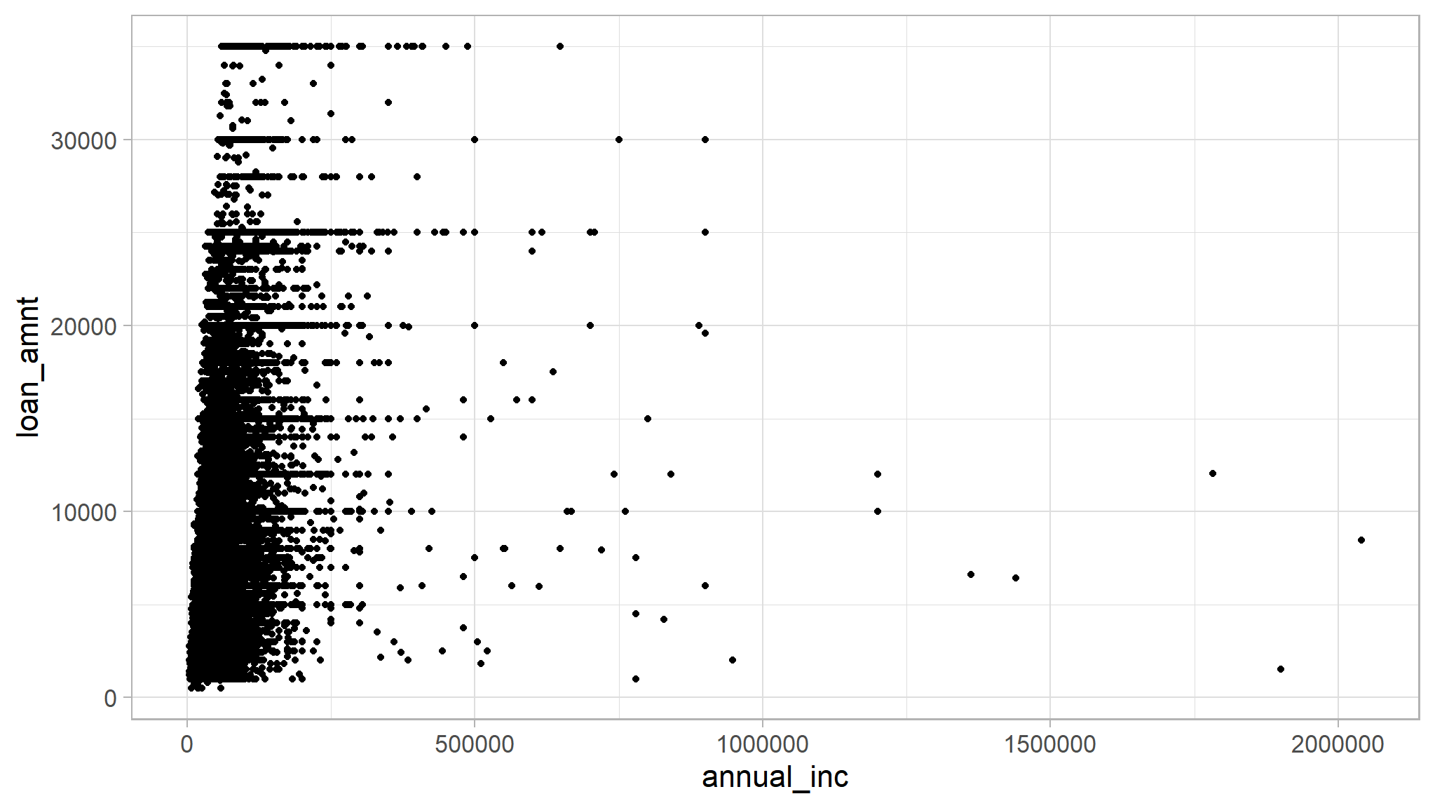
refining…
- Let’s try representing a different dimension.
- What if we want to differentiate public vs. private schools?
- We can do this using the shape attribute
ggplot(data=loan_data) +
  geom_point(mapping=aes(x=annual_inc, y=loan_amnt, shape=default))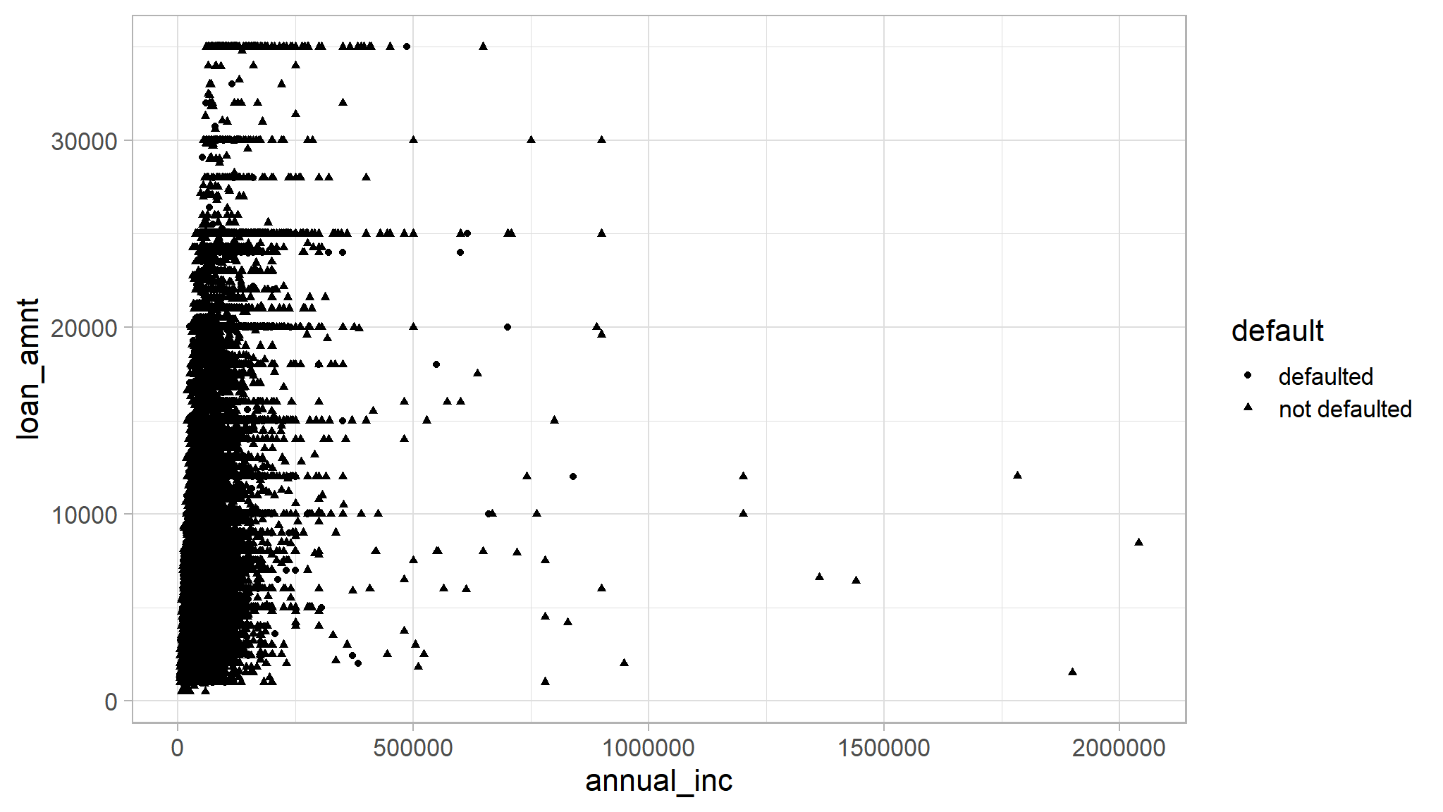
not neat!!..try color.
- That’s hard to see the difference. What if we try color instead?
ggplot(data=loan_data) +
  geom_point(mapping=aes(x=annual_inc, y=loan_amnt, color=default))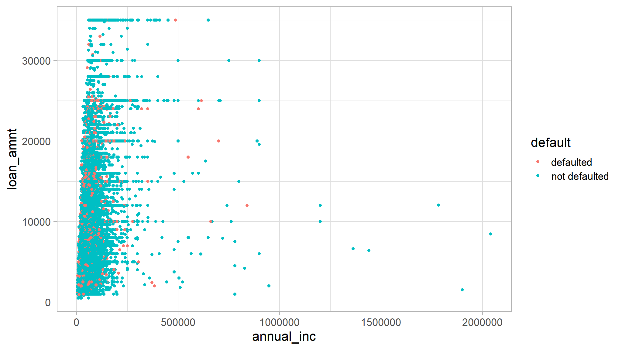
try size!
- I can also alter point size. Let’s do that to represent grade
ggplot(data=loan_data) +
  geom_point(mapping=aes(x=annual_inc, y=loan_amnt, color=default, size=grade))
transparency
- And, lastly, let’s add some transparency so we can see through those points a bit
- Experiment with the alpha value a bit.
ggplot(data=loan_data) +
  geom_point(mapping=aes(x=annual_inc, y=loan_amnt, color=default, size=grade), alpha=1)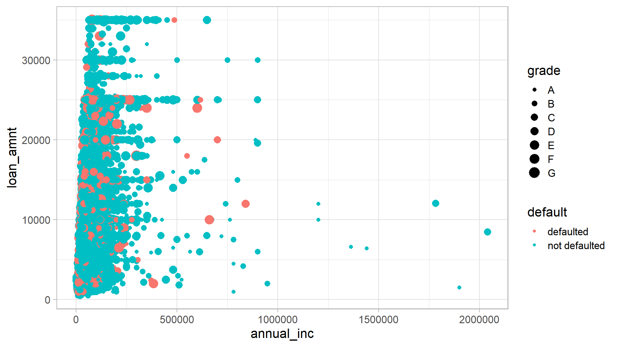
very transparent
ggplot(data=loan_data) +
  geom_point(mapping=aes(x=annual_inc, y=loan_amnt, color=default, size=grade), alpha=1/100)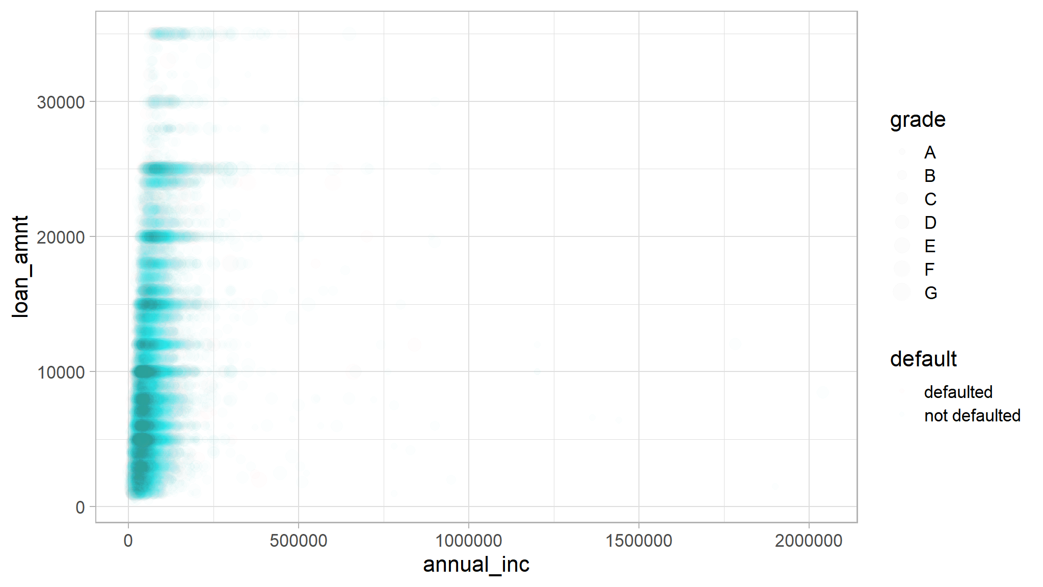
How many people defaulted?
# This calls for a bar graph!
ggplot(data=loan_data) +
  geom_bar(mapping=aes(x=default))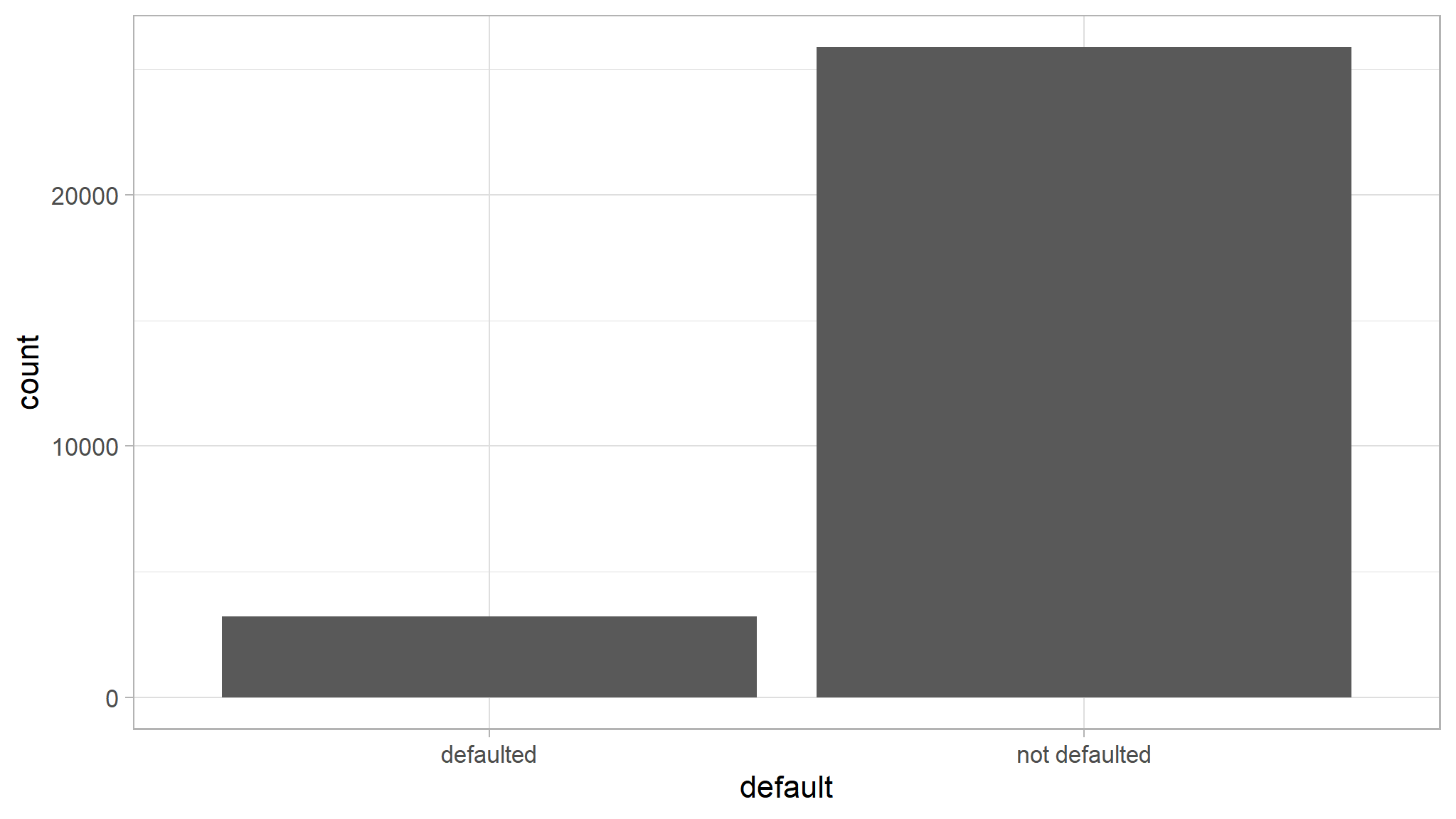
Break it out by grade
ggplot(data=loan_data) +
  geom_bar(mapping=aes(x=default, color=grade))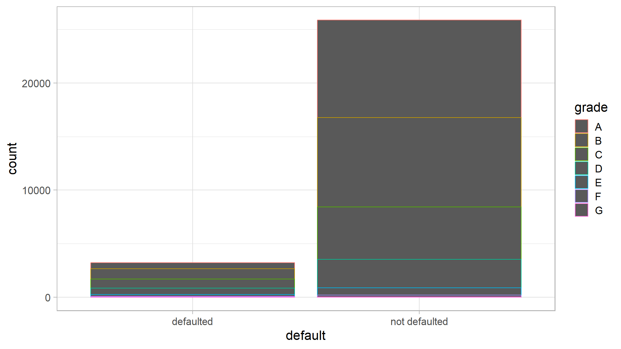
Well, that’s unsatisfying! Try fill instead of color
ggplot(data=loan_data) +
  geom_bar(mapping=aes(x=default, fill=grade))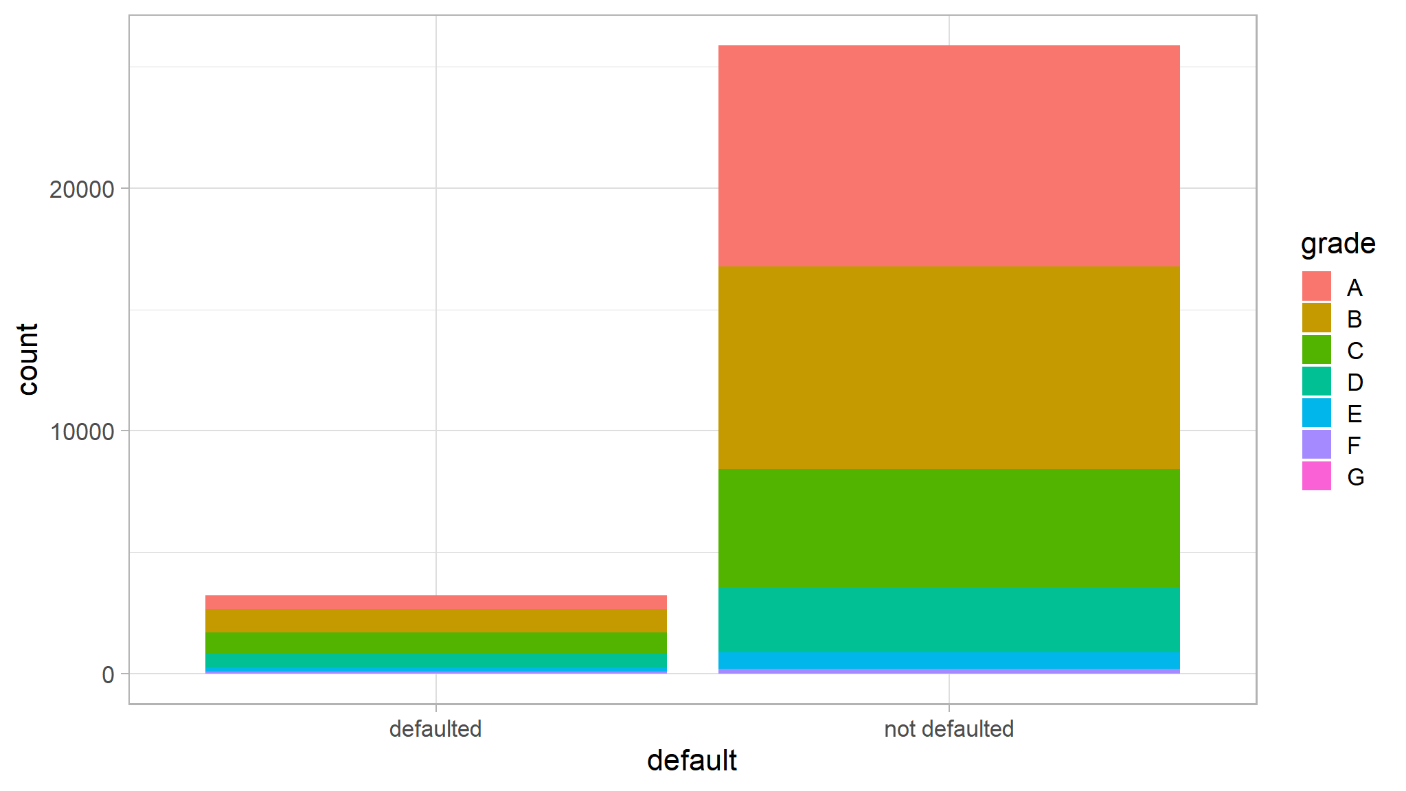
How about loan amount by default status?
- First, I’ll use some dplyr to create the right tibble
loan_data %>%
  group_by(default) %>%
  summarize(average_amount=mean(loan_amnt))
#> # A tibble: 2 × 2
#>   default       average_amount
#>   <fct>                  <dbl>
#> 1 defaulted              9389.
#> 2 not defaulted          9619.
And I can pipe that straight into ggplot
- but this will produce an error
loan_data %>%
  group_by(default) %>%
  summarize(average_amount=mean(loan_amnt)) %>%
  ggplot() +
  geom_bar(mapping=aes(x=default, y=average_amount))
use geom_col() instead
- But I need to use a column graph instead of a bar graph to specify my own y
loan_data %>%
  group_by(default) %>%
  summarize(average_amount=mean(loan_amnt)) %>%
  ggplot() +
  geom_col(mapping=aes(x=default, y=average_amount))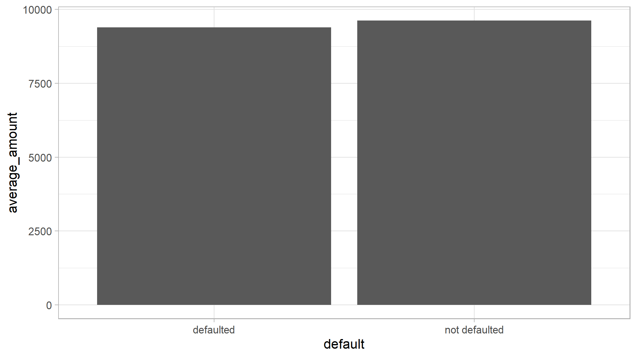
Histograms
- Let’s look at annual income
- Histograms can help us by binning results
ggplot(data=loan_data) +
  geom_histogram(mapping=aes(x=annual_inc), origin=0)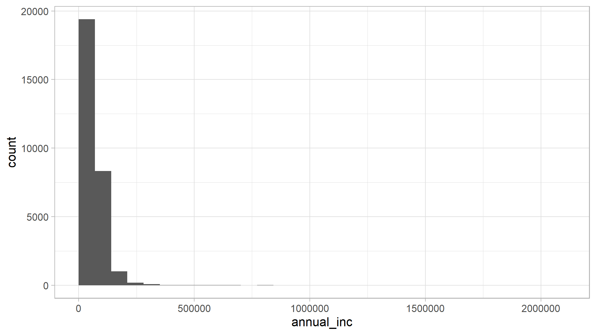
What if we want fewer groups? Let’s ask for 4 bins
ggplot(data=loan_data) +
  geom_histogram(mapping=aes(x=annual_inc), bins=4, origin=0)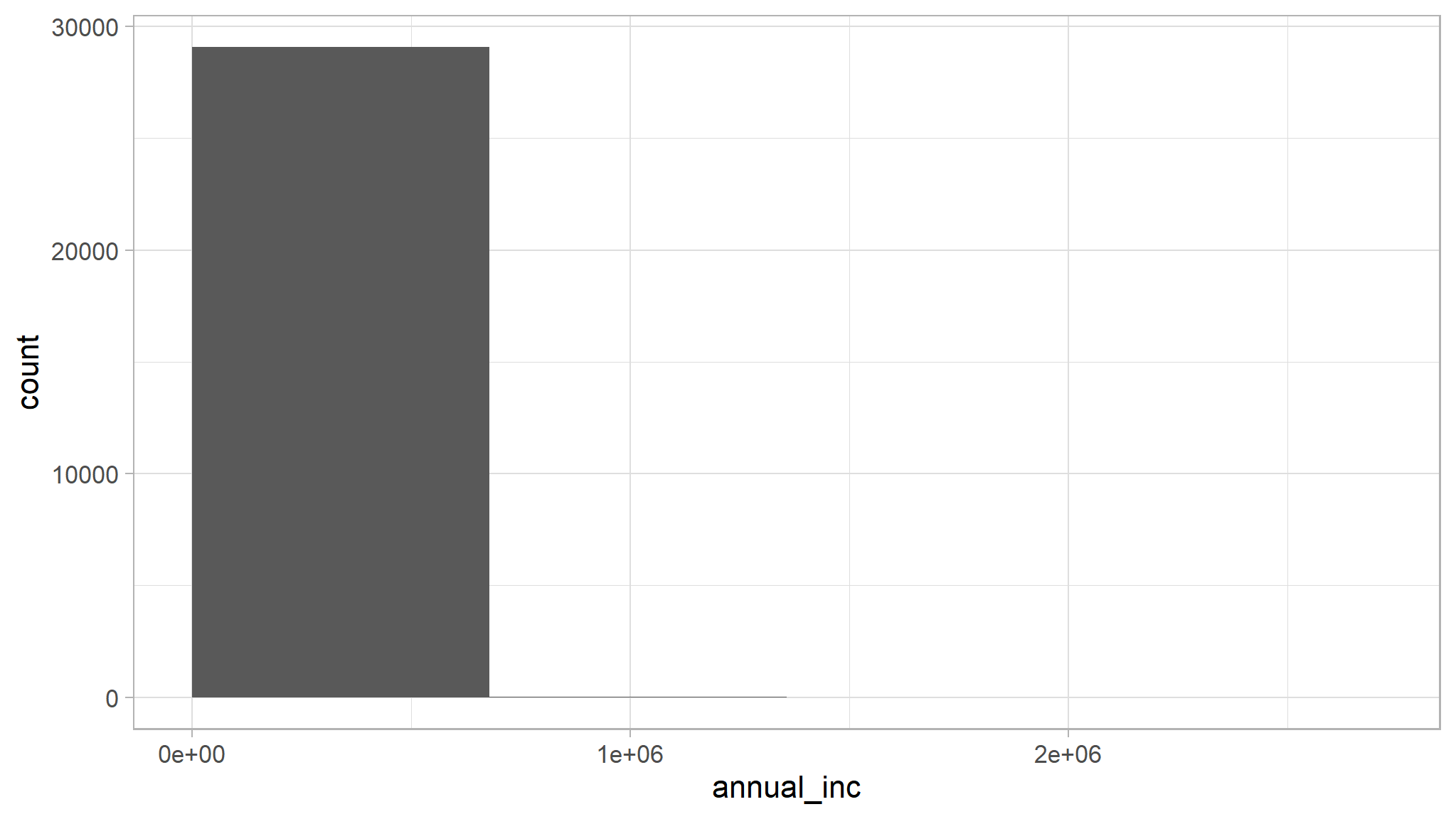
Or 10 bins.
ggplot(data=loan_data) +
  geom_histogram(mapping=aes(x=annual_inc), bins=10, origin=0)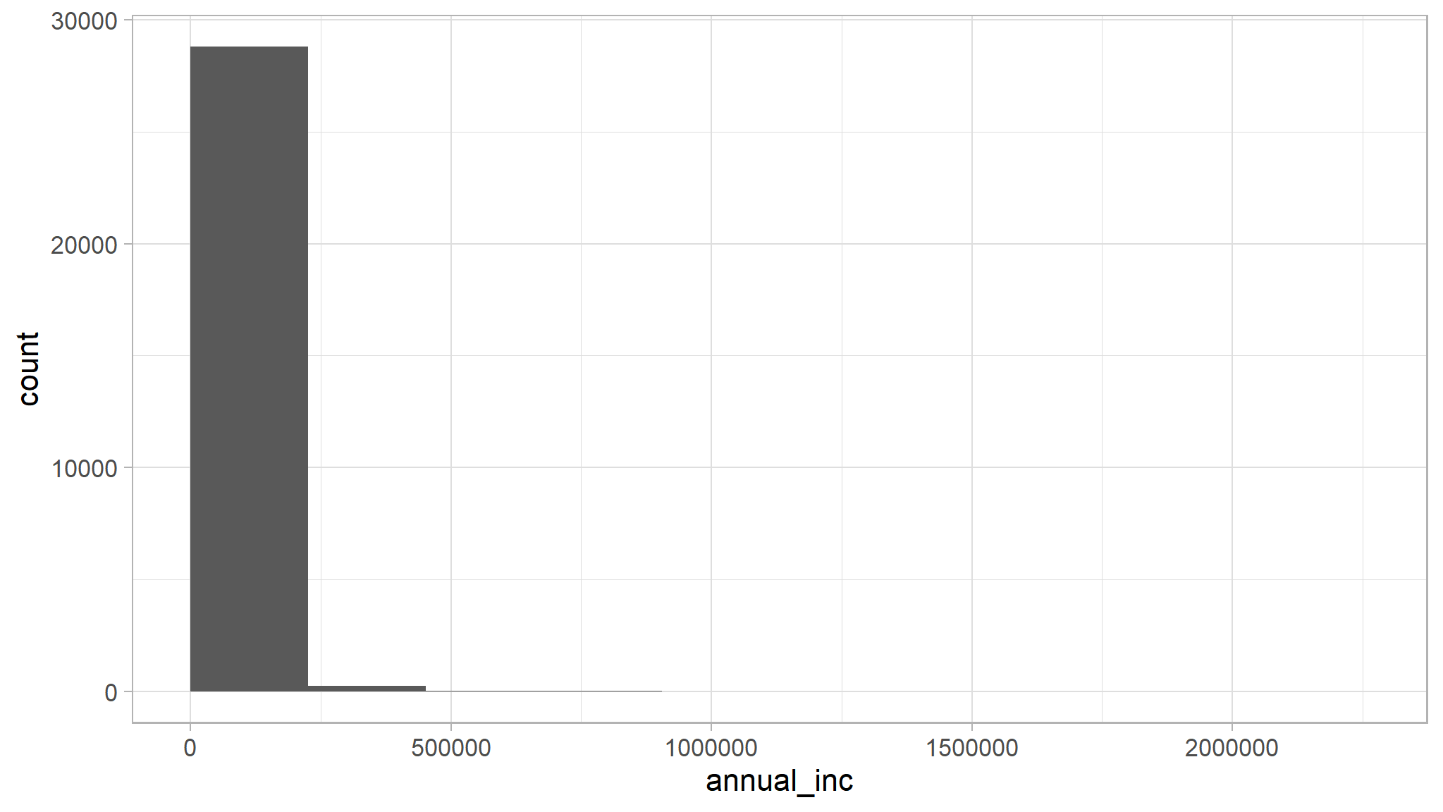
Or we can specify the width of the bins instead
ggplot(data=loan_data) +
  geom_histogram(mapping=aes(x=annual_inc), binwidth=1000, origin=0)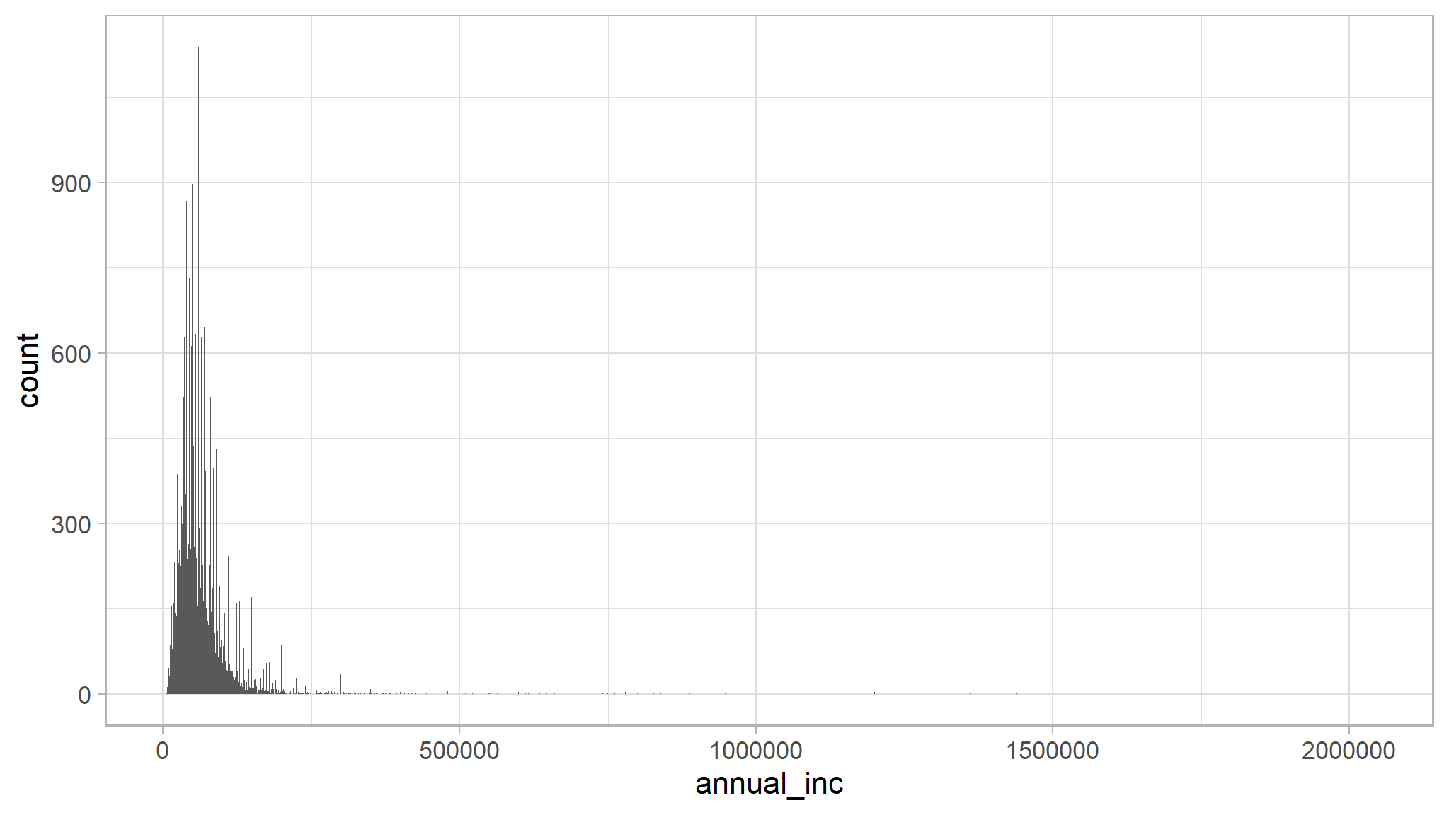
large binwidth
ggplot(data=loan_data) +
  geom_histogram(mapping=aes(x=annual_inc), binwidth=10000, origin=0)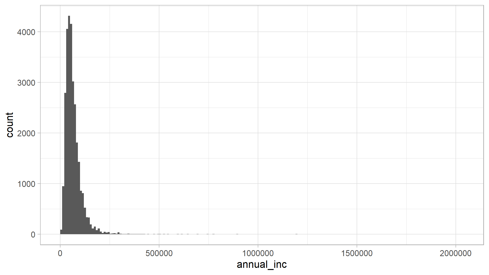
changing background
Change the plot background color
ggplot(data=loan_data) +
  geom_bar(mapping=aes(x=loan_status, fill=home_ownership)) +
  theme(plot.background=element_rect(fill='purple'))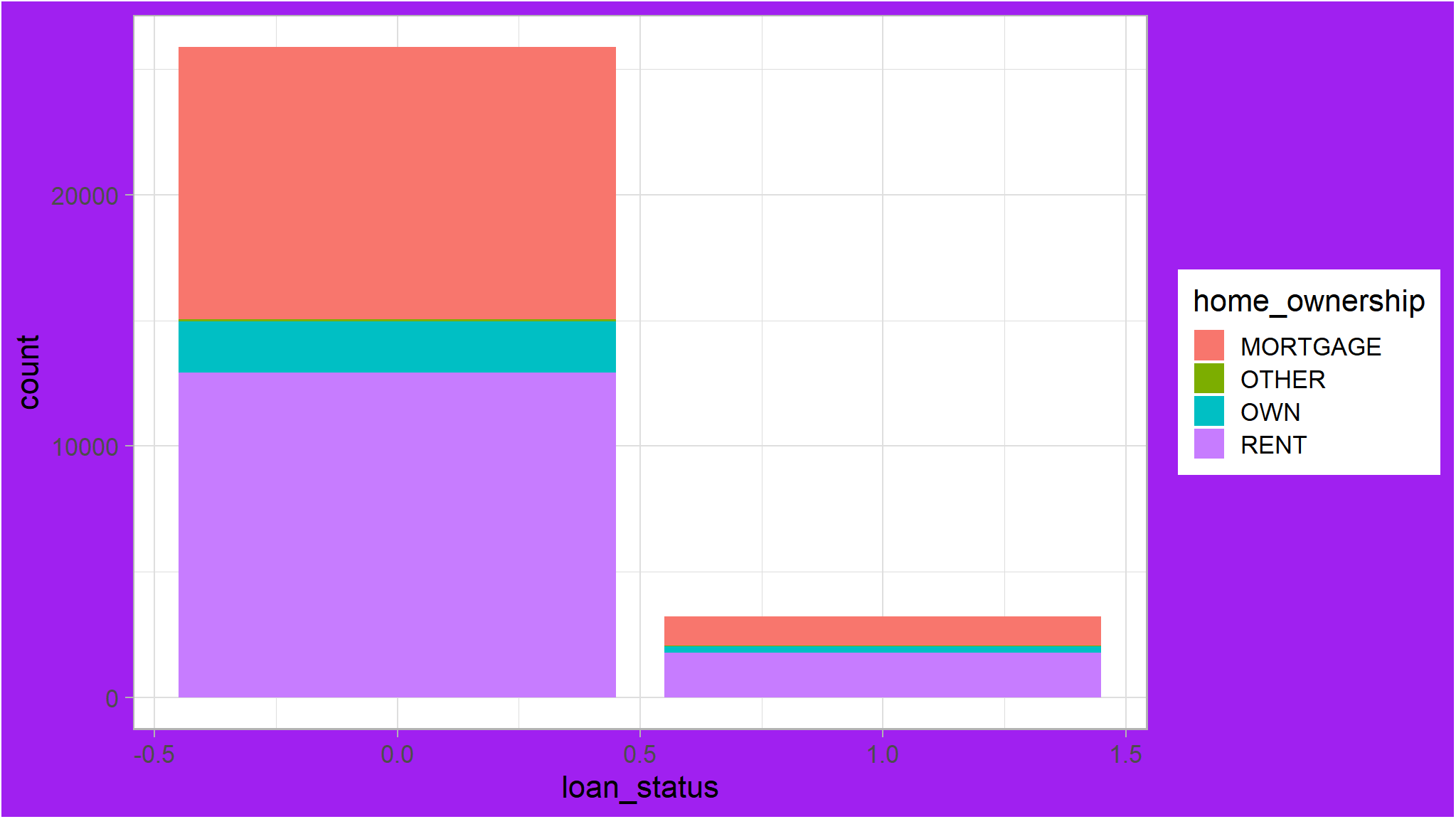
Change the panel background color
ggplot(data=loan_data) +
  geom_bar(mapping=aes(x=loan_status, fill=home_ownership)) +
  theme(panel.background=element_rect(fill='purple'))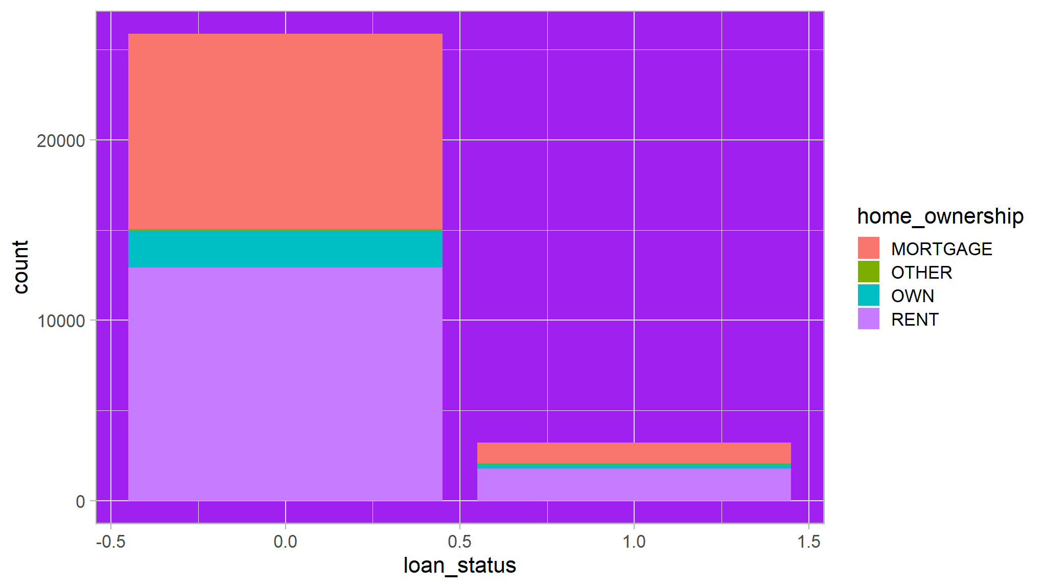
Let’s be minimalist and make both backgrounds disappear
ggplot(data=loan_data) +
  geom_bar(mapping=aes(x=loan_status, fill=home_ownership)) +
  theme(panel.background=element_blank()) +
  theme(plot.background=element_blank())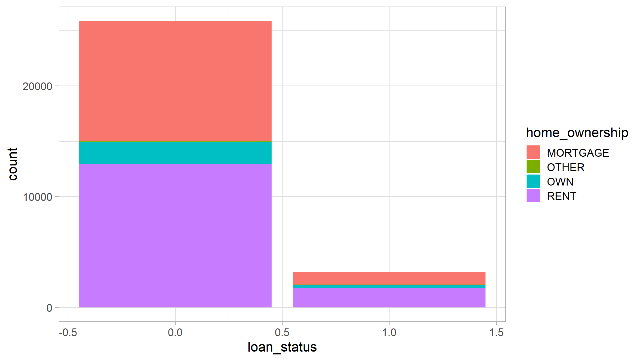
Add grey gridlines
ggplot(data=loan_data) +
  geom_bar(mapping=aes(x=loan_status, fill=home_ownership)) +
  theme(panel.background=element_blank()) +
  theme(plot.background=element_blank()) +
  theme(panel.grid.major=element_line(color="grey"))
Only show the y-axis gridlines
ggplot(data=loan_data) +
  geom_bar(mapping=aes(x=loan_status, fill=home_ownership)) +
  theme(panel.background=element_blank()) +
  theme(plot.background=element_blank()) +
  theme(panel.grid.major.y=element_line(color="grey"))+
  scale_fill_manual(values=c("orange","blue","green","blue4"))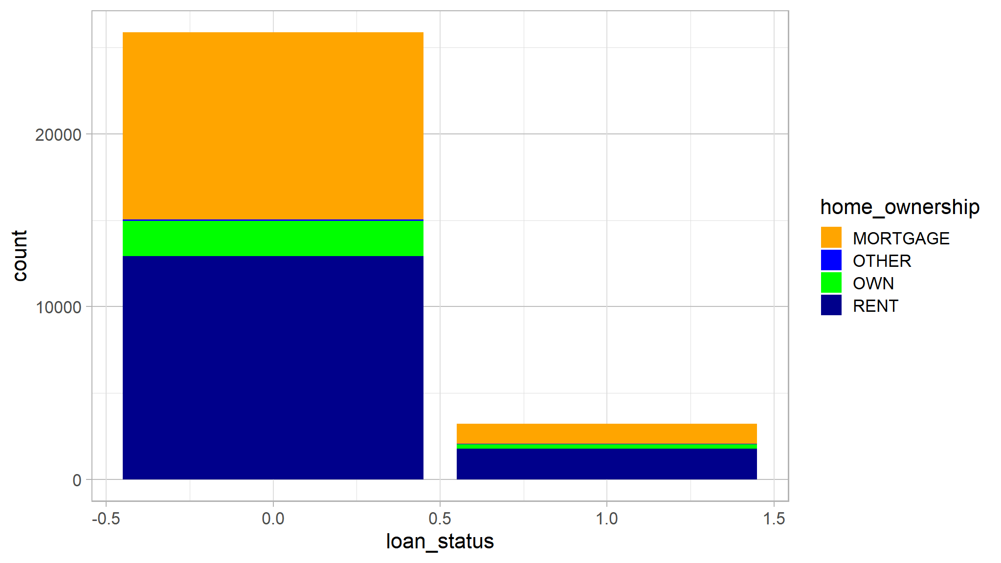
library(ggthemes)
ggplot(data=loan_data) +
  geom_bar(mapping=aes(x=loan_status, fill=home_ownership)) +
  theme(panel.background=element_blank()) +
  theme(plot.background=element_blank()) +
  theme(panel.grid.major.y=element_line(color="grey"))+
  scale_fill_manual(values=c("orange","blue","green","blue4"))+
  theme_solarized()+
  theme_wsj()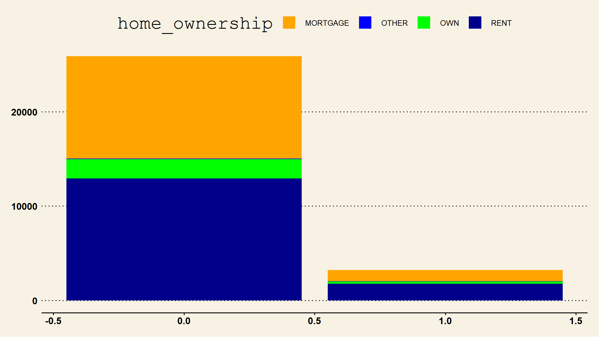
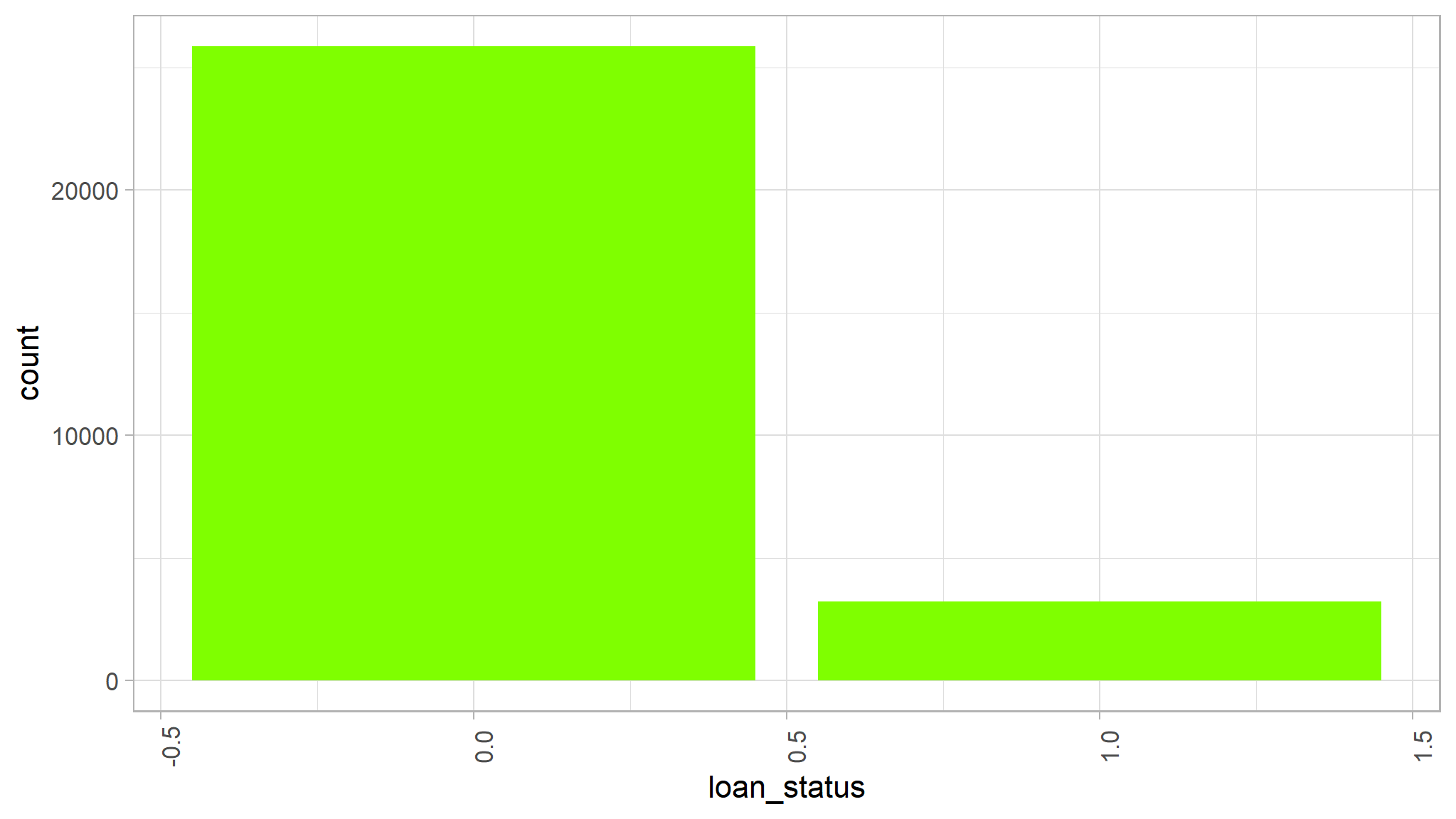
ggplot(data=loan_data, aes(x = loan_status)) +
  geom_bar(fill = "chartreuse") +
  theme(axis.text.x = element_text(angle = 90))